

Pastel Papers
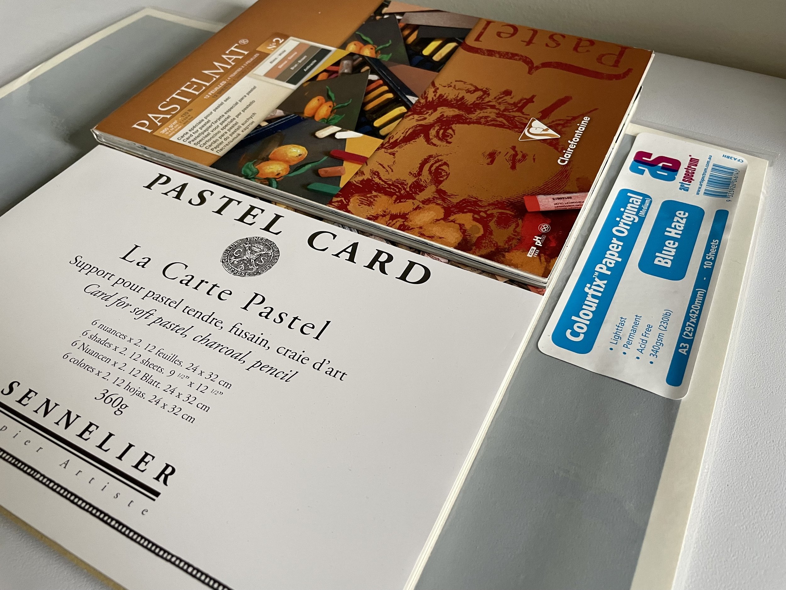
La Carte Pastel Card, Clairefontaine Pastelmat, and Colourfix Paper
Since beginning my journey with soft pastels, I immediately fell in love with Uart sanded paper, and for a long time, I didn’t even want to try anything else! There is just something about the texture, the way it works so beautifully with wet media for underpaintings, and its willingness to take layer after layer after layer of pastel, that makes it absolutely wonderful. But starting this past November, I made a concerted effort to try out several other different kinds of surfaces to see what kinds of effects I could create, and to understand which might help me best move forward more towards the vision I have for where I want to take my work. I learned a ton, found a couple of surfaces I will most definitely use moving forward, and one that I haven’t quite made up my mind about just yet…
So here we go… Pastel Papers and my thoughts….
Uart Sanded Paper and Boards -
Essentially fine grit sand paper, Uart is fantastic to work on. It takes a very heavy, wet underpainting well - you can go back in several times with wet media to really define shapes and values, before layering soft pastel, and the surface holds up beautifully. Based on the range of grits in this paper, you can work on everything from very fine to very rough paper and get a range of end results. The paper takes so many applications of pastel, and is great for both blending and raw mark making. You can create fine details, as well as loose, painterly marks. The one downside of the paper is that it only comes in a cream color (light uart) or a charcoal color (dark uart). However, I don’t mind that at all, because I am always using wet media to tone the paper. You can purchase this paper in pre-cut sizes, in a roll, or on pre-cut already mounted boards. I use a combination of all :)
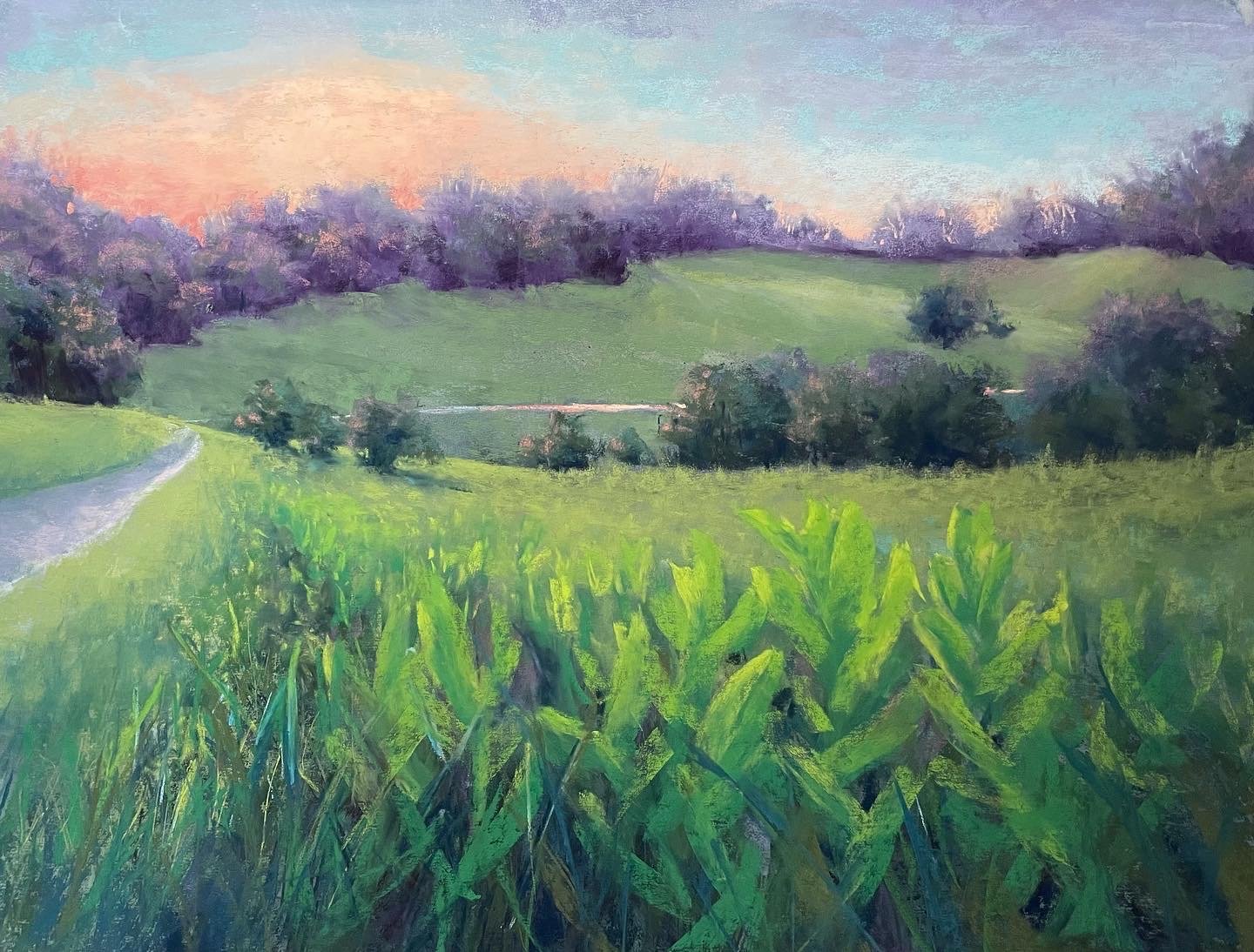
“Summer Meadow” on Uart (500 grit)
La Carte -
I have very mixed feelings about La Carte. This paper has a very gritty texture, and because of this, it’s difficult to create any kind of fine details. However, if you’re someone who likes to blend, either with your fingers or some kind of foam or other tool, you can get some very beautiful effects with this paper. I’ve created a few pieces now on this surface, and I struggle in the beginning, but in the end, the soft edges that can be created really create a lovely, dreamy quality. However, my biggest gripe with La Carte is the amount of pastel dust that falls off the surface, both during the painting process (I feel like I waste so much pastel because so much is sanded off my sticks with each swipe!), and during the framing process. The amount of fallout when I put La Carte paintings under glass is tremendous, and I’ve had to redo my framing a few times in order to clean the pastel off the glass or off of my mats during the process. It’s incredibly frustrating, but with patience and a lot of care, you can get a beautifully framed piece in the end. The jury is still out for me on if the end result is worth the headaches…

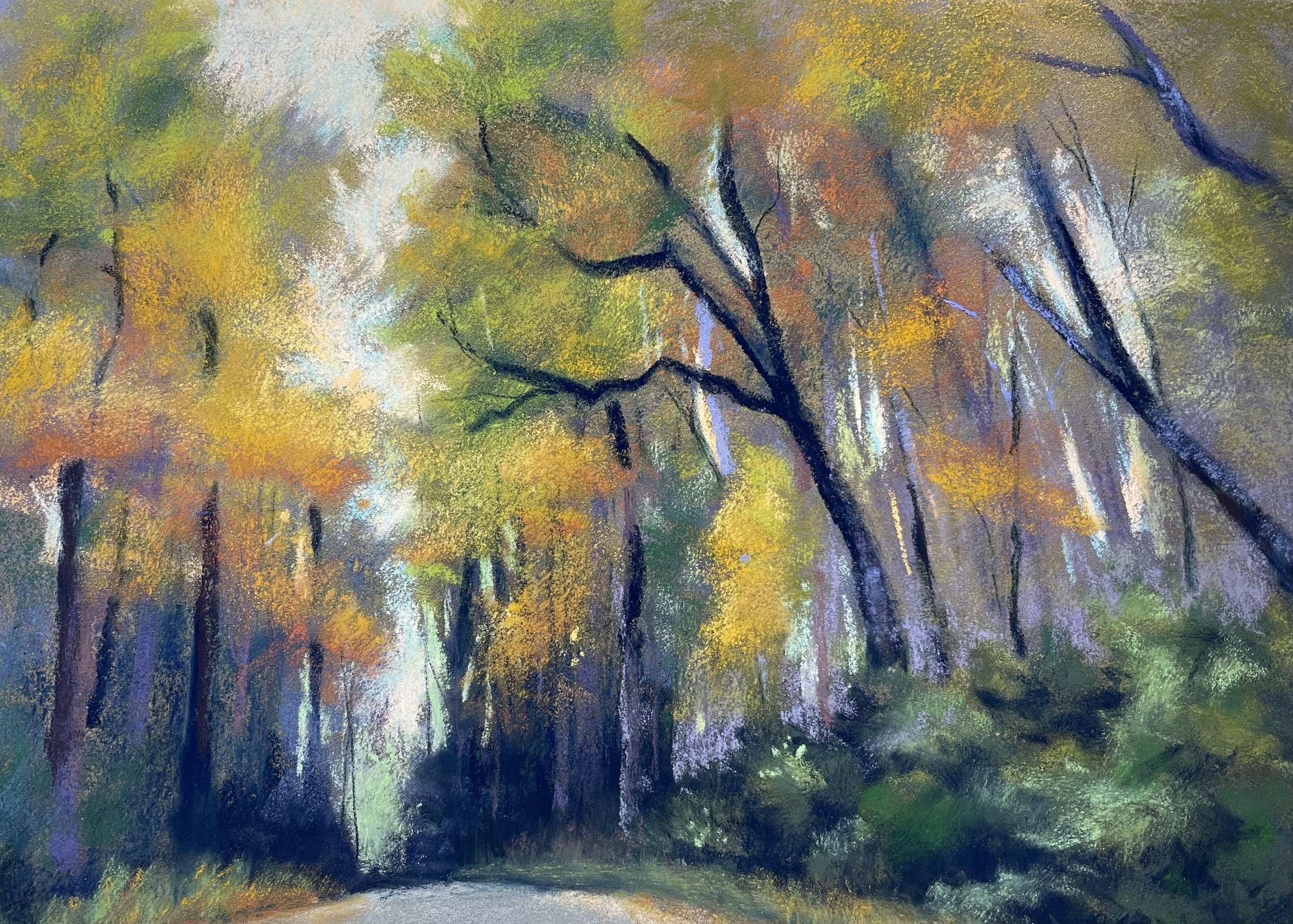
Pastelmat -
The velvety quality of this paper is just lovely and so different from many of the other more textured surfaces I’ve worked on before. Like Uart, it takes wet media well, but in a different way… it absorbs the wet media rather quickly and is a bit harder to move it around on the paper. That being said, because of the way it absorbs, you can get a very strong underpainting with very clearly defined values established using this paper. The surface takes layer after layer of pastel, but isn’t a paper that is great for blending. I like it a lot for making strong, bold marks, in a more painterly fashion. And overall, I love this paper to take with me for plein air color studies or when I’m traveling in general. It comes in a wide range of beautiful, earthtone colors and is sold in pads with glassine in between each sheet, which is really fantastic. When it comes to framing work done on pastelmat, it’s a breeze - because of the way the paper grabs and holds pastel, there really isn’t a lot of dust that falls off the final piece, and so when a painting is framed under glass, you don’t have to worry about pastel dust on your glass or falling onto your mat board.

“The Beauty of Melancholy” on Pastelmat
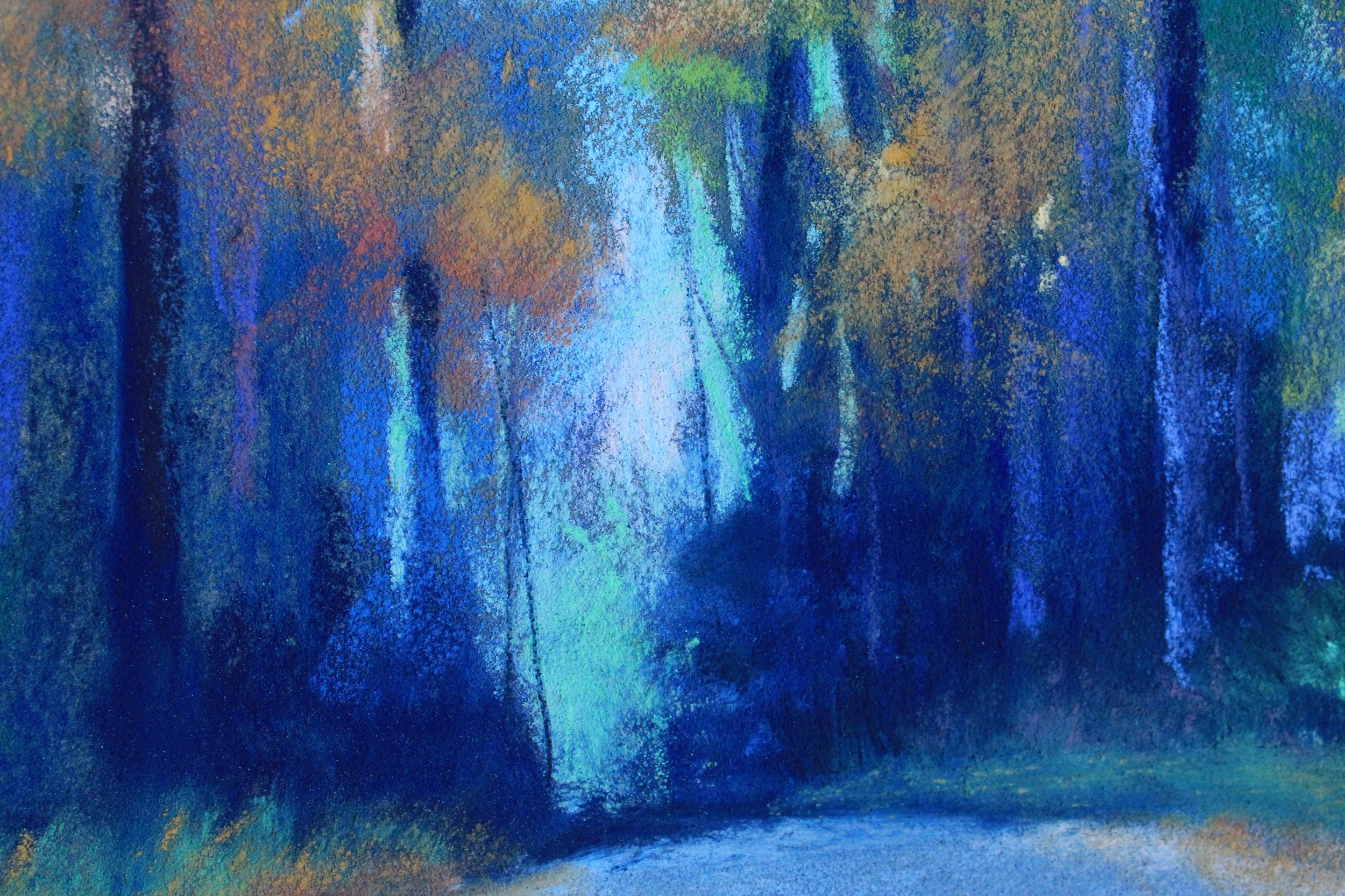
Colourfix -
I had no preconceived notions about this paper, and ended up really liking it. I bought pre-mounted colourfix paper, but you can get this in sheets as well. It comes in a very large range of colors, and is a key point of differentiation for me. This surface to me falls somewhere in between uart and pastelmat. It has more of a uart, gritty texture, but takes wet media underpainting a bit more like the pastelmat. I did go a little heavy on the wetness of my underpainting on one piece and it did impact my ability to make precise marks, but generally, I found I could get a nice mixture of marks, from fine to bold, on this surface, and pastels blend very nicely on it too. In full disclosure, I haven’t framed anything I’ve done on Colourfix just yet, so I’ll have to come back at a later date and let you know how that goes!

Untitled, on blue haze Colourfix
I’ll be sure to update this post as I try out new surfaces in the future. If you are a fellow pastelist, I’d love to hear what your favorite surfaces are to work on and why. If you’re a lover of pastel artwork, I’d love to know which papers, from a finished perspective, resonate most with you after seeing the artwork in this post. Please don’t be shy - I’d love to hear from you! :)